Well, fret no more, Arthur Buxton's van Gogh visualization might be the solution to your problem!
 Buxton's pie charts show the percentages of different colours used in different van Gogh paintings. It's art as statistics!
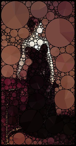
Mario Klingemann uses pie charts in a similar way to give famous paintings new life with his "pie packed" pictures. Here are Michelangelo's Creation of Adam and Vermeer's The Girl with a Pearl Earring:

 The principle is the same here as with Buxton's pie charts - each pie shows the percentage of different colours in the area that it covers. It's statistics as art!
And as I'm writing about pie charts that describe a picture, I can't help but bring up this old XKCD picture:
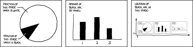
It's funny because it's true. Incidentally, XKCD also did pie charts relating to some of the old masters.
The LoveStat blog recently wrote about both Buxton and Klingemann. My main reason for writing this post is to remind myself that I still haven't framed the van Gogh posters I bought in Amsterdam four years ago.