Wednesday, December 14, 2011

Are Higgs findings due to chance?

As media all over the world are reporting that scientists at CERN may have glimpsed the Higgs particle for the first time, journalists struggle to explain why the physicists are reluctant to say that the results are conclusive. Unfortunately, they seem to be doing so by grossly misinterpreting one of the key concepts in modern statistics: the p-value.


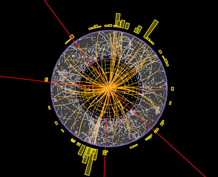
First of all: what does statistics have to do with the Higgs boson findings? It seems that there would be no need for it - either you've seen the God particle, or you haven't seen the Goddamn particle. But since the Higgs boson is so minuscule, it can't be observed directly. The only chance of detecting it is to look for anomalies in the data from the Large Hadron Collider. There will always be some fluctuations in the data, so you have to look for anomalies that (a) are large enough and (b) are consistent with the properties of the hypothesised Higgs particle.

What the two teams at CERN reported yesterday is that both teams have found largish anomalies in the same region, independently of each other. They quantify how large the anomalies are by describing them as, for instance, as being roughly "two sigma events". Events that have more sigmas, or standard deviations, associated with them are less likely to happen if there is no Higgs boson. Two sigma events are fairly rare: if there is no Higgs boson then anomalies at least as large as these would only appear in one experiment out of 20. This probability is known as the p-value of the results.

This is were the misinterpretation comes into play. Virtually every single news report on the Higgs findings seem to present a two sigma event as meaning that there is a 1/20 probability of the results being due to chance. Or in other words, that there is a 19/20 probability that the Higgs boson has been found.

In what I think is an excellent explanation of the difference, David Spiegelhalter attributed the misunderstanding to a missing comma:

The number of sigmas does not say 'how unlikely the result is due to chance': it measures 'how unlikely the result is, due to chance'.

The difference may seem subtle... but it's not. The number of sigmas, or the p-value, only tells you how often you would see this kind of results if there was no Higgs boson. That is not the same as the probability of there being such a particle - there either is or isn't a Higgs particle. Its existence is independent of the experiments and therefore the experiments don't tell us anything about the probability of the existence.

What we can say, then, is only that the teams at CERN have found anomalies that suspiciously large, but not so large that we feel that they can't be due simply to chance. Even if there was no Higgs boson, anomalies of this size would appear in roughly one experiment out of twenty, which means that they are slightly more common than getting five heads in a row when flipping a coin.

If you flip a coin five times and got only heads, you wouldn't say that since the p-value is 0.03, there is a 97 % chance that the coin only gives heads. The coin either is or isn't unbalanced. You can't make statements about the probability of it being unbalanced without having some prior information about how often coins are balanced and unbalanced.

The experiments at CERN are no different from coin flips, but there is no prior information about in how many universes the Higgs boson exists. That's why the scientists are reluctant to say that they've found it. That's why they need to make more measurement. That's why two teams are working independently from each other. That's why there isn't a 95 % chance that the Higgs boson has been found.

David Spiegelhalter tweeted about his Higgs post with the words "BBC wrong in describing evidence for the Higgs Boson, nerdy pedantic statistician claims". Is it pedantic to point out that people are fooling themselves?

I wholeheartedly recommend the Wikipedia list of seven common misunderstandings about the p-value.

Wednesday, April 6, 2011

Speeding up R computations

The past few days I've been going through some R code that I wrote last year, when I was preparing a massive simulation-based power study for some tests for multivariate normality that I've been working on. My goal was to reduce the time needed to run the simulation. I wasn't expecting great improvement, since I've always believed that the most common R functions are properly vectorized and optimized for speed. Turns out I was wrong. Very wrong.


The first thing that I did was that I replaced all parentheses ( ) by curly brackets { }. I was inspired to do so by this post (and this, via Xi'Ans Og) over at Radford Neal's blog. As he pointed out, code that uses parentheses is actually slower than the same code with curly brackets:

> system.time( for(i in 1:1000000) { 1*(1+1) } )
   user  system elapsed 
  1.337   0.005   1.349 
> system.time( for(i in 1:1000000) { 1*{1+1} } )
   user  system elapsed 
  1.072   0.003   1.076 

Similarly, you can compare a*a and a^2:

> system.time( for(i in 1:10000000) 3^2 )
   user  system elapsed 
  5.048   0.028   5.088 
> system.time( for(i in 1:10000000) 3*3 )
   user  system elapsed 
  4.721   0.024   4.748 

So, a^2 is slower than a*a. This made me wonder, are there other built-in R functions that are slower than they ought to be?

One thing that I found very surprising, and frankly rather disturbing, is that mean(x) takes ten times as long to calculate the mean value of the 50 real numbers in the vector x as the "manual" function sum(x)/50:


> x<-rnorm(50)
> system.time(for(i in 1:100000){mean(x)})
   user  system elapsed 
  1.522   0.000   1.523 
> system.time(for(i in 1:100000){sum(x)/length(x)})
   user  system elapsed 
  0.200   0.000   0.200 
> system.time(for(i in 1:100000){sum(x)/50})
   user  system elapsed 
  0.167   0.000   0.167 
> system.time(for(i in 1:100000){ overn<-rep(1/50,50); x%*%overn })
   user  system elapsed 
  0.678   0.000   0.677 
> overn<-rep(1/50,50); system.time(for(i in 1:100000){ x%*%overn })
   user  system elapsed 
  0.164   0.000   0.164 

I guess that the R development core team have been focusing on making R an easy-to-use high level programming language rather than optimizing all functions, but the poor performance of mean is just embarrassing.

Similarly, the var function can be greatly improved upon. Here are some of the many possibilites:


> x <- rnorm(50)
> system.time( for(i in 1:100000) { var(x) } )
   user  system elapsed 
  4.921   0.000   4.925 
> system.time( for(i in 1:100000) { sum((x-mean(x))^2)/{length(x)-1} } )
   user  system elapsed 
  2.322   0.000   2.325 
> system.time( for(i in 1:100000) { {sum(x*x)-sum(x)*sum(x)/length(x)}/{length(x)-1} } )
   user  system elapsed 
  0.736   0.000   0.737 
> system.time( for(i in 1:100000) { {sum(x*x)-sum(x)*sum(x)/50}/49 } )
   user  system elapsed 
  0.618   0.000   0.618 

> system.time( for(i in 1:100000) { sx<-sum(x); {sum(x*x)-sx*sx/50}/49 } )
   user  system elapsed 
  0.567   0.000   0.568

I changed all the uses of mean in my code to "sum/n" instead (and avoided using var entirely) and found that this sped things up quite a bit.

Another trick to speed up your computations is to create the vectors that you wish to change within a loop with the right number of elements. While

a<-NA
for(j in 1:100) a[j]<-j 

works just fine, it is actually quite a bit slower than

a<-rep(NA,100)
for(j in 1:100) a[j]<-j

You could create a in other ways as well of course, for instance by a<-vector(length=100). Here are the numbers:


> system.time( for(i in 1:100000) { a<-NA; for(j in 1:100) a[j]<-j })
   user  system elapsed 
 37.383   0.092  37.482 
> system.time( for(i in 1:100000) { a<-rep(NA,100); for(j in 1:100) a[j]<-j })
   user  system elapsed 
 25.866   0.065  25.936 
> system.time( for(i in 1:100000) { a<-vector(length=100); for(j in 1:100) a[j]<-j })
   user  system elapsed 
 25.517   0.022  25.548

In my case, I'd been a bit sloppy with creating the vectors in my loops in the proper way, so I changed this in my code as well.

In my simulation study, I simulate multivariate random variables, compute some test statistics and use these to estimate the powers of the normality tests against various alternatives. After doing the changes mentioned above, I compared the performance of my old code to that of the new code, for 1000 iterations of the procedure:

> system.time( source("oldCode.R") )
   user  system elapsed 
548.045   0.273 548.622 
> system.time( source("newCode.R") )
   user  system elapsed 
 93.138   0.002  93.194

The improved code is almost 6 times faster than the old code. When you do ten million or so iterations, that matters. A lot.

In conclusion, it's definitely possible to speed up your code significantly if you know of the pitfalls of R. I suspect that I'll be obsessed with finding more pitfalls in the next few weeks, so I'd be thankful for any hints about other weaknesses that R has.

It should probably be mentioned that R is really fast when things are properly vectorized. Last year, a coworker that uses Matlab challenged me to perform a number of matrix computations faster in R than in Matlab. To his great surprise, R won.

As a final remark, I'm now facing a bit of a dilemma. Should I write readable code; a^6; or fast code; a*a*a*a*a*a?

Update: looking to speed up your R computations even more? See my posts on compiling your code and parallelization.

Tuesday, February 15, 2011

Narcolepsy and the swine flu vaccine

Earlier this year the Finnish National Institute for Health and Wellfare published a report about the increased risk of narcolepsy observed among children and adolescents vaccinated with PandemrixR. In short, the conclusion was that the swine flu vaccine seemed to have had an unexpected side effect; the risk of narcolepsy, a sleeping disorder disease, was larger for vaccinated children in the 4-19 year age group than for unvaccinated children in the same age group.


Steven Novella at Science-Based Medicine wrote a great piece about this last week, discussing how this should be interpreted. I'm not going to go into a discussion about the findings themselves, but I would like to discuss the following part of the press release:

In Finland during years 2009–10, 60 children and adolescents aged 4-19 years fell ill with narcolepsy. These figures base on data from hospitals and primary care, and the review of individual patient records by a panel of neurologists and sleep researchers. Of those fallen ill, 52 (almost 90 percent) had received Pandemrix® vaccine, while the vaccine coverage in the entire age group was 70 percent. Based on the preliminary analyses, the risk of falling ill with narcolepsy among those vaccinated in the 4-19 years age group was 9-fold in comparison to those unvaccinated in the same age group.

Sceptical commenters on blogs and forums have questioned whether a 9-fold increase in risk really was observed. Here's the reasoning:

The estimated risk within a group is (the number of observed cases of the disease)/(size of the group). That is,

Risk for vaccinated child: 52/(n*0.7) = 1/n * 52/0.7
Risk for unvaccinated child: 8/(n*0.3) = 1/n * 8/0.3

where n is the number of children in the 4-19 age group.

So that the relative risk, i.e. the risk increase for the vaccinated children, is

(52/0.7)/(8/0.3)=2.79 .

Hang on a minute. 2.79? If a 9-fold increase in risk was observed the relative risk should be 9! It seems that the Finnish epidemiologists made a mistake.

...or did they?

Not necessarily. When analyzing this data, we need to take time into account. The report itself is only available in Finnish, but using Google Translate I gathered that the unvaccinated group were studied from January 2009 to August 2010 whereas the vaccinated individuals were studied from the date of vaccination and eight months on. In other words, the unvaccinated group had a longer time span in which they could fall ill.

That means that in order to calculate the relative risk, we need to divide the number of cases by the number of months that the groups were studied, to get the risk per month. That eliminates the time factor. After doing this, the relative risk becomes

((52/8)/0.7)/((8/20)/0.3)=6.96.

That's higher, but still not 9. Well, to complicate things a bit it seems that an individual was considered to be a part of the unvaccinated group until the date of vaccination, making the calculations a bit more difficult. When that is taken into account, along with other difficulties that no doubt occur when you have the actual data at hand, the relative risk probably becomes 9.

The full report is not yet available, so I can't say how close the above approach is to the one that was actually used in the analysis. Nevertheless, I hope that this post can help shed some light on the statistics behind the statement about a 9-fold increase.

A problem with this approach is that the number of months under which the unvaccinated group was studied might affect the results, just as in the shark attack example that I wrote about last week. Changing the time span for the unvaccinated group to January 2008 to August 2010, say, does however not change the conclusion in this case. The analysis seems to be pretty robust to the length of time under which the control group were studied.

WHO issued some comments regarding the Finnish study that are well worth reading.

Thursday, February 10, 2011

Sharks! Sharks!

The International Shark Attack File, or ISAF for short, recently published their 2010 worldwide shark attack summary and the findings have been reported by international media the last couple of days. The main message has been that the number of unprovoked shark attacks last year, 79, was larger than usual.

The question that is left unanswered in the articles that I've read is "just how unusual is 79 shark attacks in a year?" Let's find out!


Assume that a trial is performed n independent times (where n is large) and that at each trial the probability p of some given event is small. If X is the number of trials in which the event occurs, then X will be Poisson distributed. This means that the probability that X equals some value k will be

P(X=k)=mk/k!*e-m

where k!=k*(k-1)*(k-2)*...*3*2*1 and m=n*p is the average number of times that the event will occur. This fact has not only been seen empirically, but can also be proved using "basic" tools of probability theory.

Now, a large number of people, n, spend time in the sea each year, and for each such person there is a small probability, p, that the person is attacked by a shark. The people are more or less independent, and therefore we can argue that the number of shark attacks in a year should be (at least approximately) Poisson distributed.

For the mathematically minded, I should probably point out that I'm aware that the shark attack probabilities pi differ between different areas. This does not really contradict the assumption that shark attacks follow a Poisson process, as we can view the global shark attacks as the union of (essentially) independent Poisson processes with different intensities.

If we want to calculate the probability of a certain number of shark attacks, we now need to estimate the average number of shark attacks in a year, m. Well, from the ISAF 2000-2010 statistics we see that there's been an average of 71.5 shark attacks annually, or an average of 63.6 if we only look at the 2000-2009 period. Let's assume that the intensity of shark attacks has been constant throughout the last eleven years and that deviations from the mean are random and not due to some trend. In that case we can use the above averages as our estimates of m.

Using the estimate m=71.5 we get that the probability of at least 79 shark attacks in a year is 0.17, which means that we should expect more than 79 shark attacks roughly once in every six years. In the last eleven years there has been two such years, 2000 (80 attacks) and 2010 (79 attacks), which is more or less exactly what we would expect.

If we instead use the lower estimate m=63.6 we get that the probability is 0.026, which would mean that we can expect at least 79 shark attacks once in 38 years.

Were we to use the 2001-2009 data only, our estimate would be m=55.6 and the estimated probability of at least 79 sharks attacks would be as small as 0.001. In this scenario, 2010 would have been a one-in-a-thousand extreme when it comes to shark attacks!

There's actually a valuable lesson here. By choosing different years to include when calculating our estimate of m we arrived at completely different conclusions. It was easy for us to do in this example, and it's just as easy for anyone else to do when they want to present statistics. Lies, damn lies, ...

People tend to be afraid of sharks, and it is therefore interesting to note that out of the 79 sharks attacks last year, only 6 were fatal. According to the CIA World Factbook, 56.6 million people died in 2010. That means that the risk of being killed by a shark is approximately 0.0000001! That's a pretty abstract number, but maybe the "What's most likely to kill you?" infographic can help you visualize it. It illustrates the risks of various causes for death, but does unfortunately not include shark attacks... The ultimate shark infographic is probably this one, from last year.

Actually, this global shark catch graph tells us that the sharks are the ones who need to fear the humans.

On a side note, I teach a course called Statistics for engineers this semester and when I introduced the Poisson distribution two weeks ago, I used shark attacks as an example of an application of the distribution (along with some engineering applications, of course). I was inspired by this paper, from which I also borrowed a data set about the number of points Wayne Gretzky scored in each game during his time in Edmonton Oilers. Funnily, I gave the lecture on January 26, which was Gretzky's 50th birthday. When I introduced the binomial distribution I used the predictions of the 2010 FIFA world cup oracle Paul the Octopus as an illustrating example, who happened to be born on the 26th of January as well. This allowed me to move seamlessly on to the birthday problem ("what is the probability that there is at least one pair of people in this room that have the same birthday?"), which we could solve using the binomial and Poisson distributions. Sometimes Fortuna is on your side...

As I have more than 120 students in the course, the probability of at least on pair of people sharing a birthday was ridiculously close to 1.

Thursday, February 3, 2011

Art as statistics / statistics as art

Have you ever felt that you would love to have a classic painting hanging on your wall, but that it just isn't scientific enough? After all, you wouldn't want people to think that you're anything less than a completely rational scientifically minded person.

Well, fret no more, Arthur Buxton's van Gogh visualization might be the solution to your problem!

Buxton's pie charts show the percentages of different colours used in different van Gogh paintings. It's art as statistics!

Mario Klingemann uses pie charts in a similar way to give famous paintings new life with his "pie packed" pictures. Here are Michelangelo's Creation of Adam and Vermeer's The Girl with a Pearl Earring:


The principle is the same here as with Buxton's pie charts - each pie shows the percentage of different colours in the area that it covers. It's statistics as art!

And as I'm writing about pie charts that describe a picture, I can't help but bring up this old XKCD picture:


It's funny because it's true. Incidentally, XKCD also did pie charts relating to some of the old masters.

The LoveStat blog recently wrote about both Buxton and Klingemann. My main reason for writing this post is to remind myself that I still haven't framed the van Gogh posters I bought in Amsterdam four years ago.